

WILD and Wholesome
Wild & Wholesome is a brand rooted in fresh ideas and bold design choices, inspired by the playful spirit of pets and the growing demand for natural care. This book offers a glimpse into the creative process behind a reimagined identity—one that’s vibrant, modern, and full of personality. Dive in to see how every detail comes together to tell the story of a brand that’s as unique as the pets it’s made for.
MOODBOARD
Wild & Wholesome’s new identity draws on a vibrant moodboard featuring bold colors, playful pet imagery, and sleek packaging designs. Key guiding words helped shape a look that’s as modern and clean as your favorite organic brands—yet daring enough to pop off the shelf. Inspired by the energetic styles of brands like Ghost and Goodles, this design merges contemporary minimalism with a burst of fun, creating an inviting and eye-catching presence for pet owners of every age.


MODERN
Fun


illustrative
Playful

Vibrant
Organic

Sketches


INTIAL DESIGNS


COLOR PAlette
The Wild & Wholesome color palette is filled with playful, vibrant hues that bring energy and personality to the brand. Each color is carefully chosen to enhance the fun, illustrative style of the Wild & Wholesome identity, creating a look that feels fresh and inviting. The palette includes specific pairings for each animal character and coordinating colors for the packaging, ensuring a cohesive yet lively feel across all brand visuals. These colors help reinforce the brand’s mission to make natural pet care both approachable and joyful.

TYPE FAMILY
For Wild & Wholesome, I chose the font Filip as the primary display typeface because of its playful, approachable, and loose aesthetic, perfectly matching the brand's fun and illustrative personality. It complements the whimsical animal illustrations and organic theme. To balance this, I paired it with Univers, a clean and neutral sans-serif font, providing readability and structure for body text and details. This combination creates a dynamic yet cohesive typographic hierarchy, balancing playfulness with clarity and professionalism.

Animal Icons
The Wild & Wholesome brand is brought to life through these playful illustrated characters that capture the lively, fun nature of pets. I chose this illustrative style to break away from the often rigid look of organic brands, making each product feel inviting and fun. Each character serves as a mascot for its group, helping pet owners easily connect the brand to products for different types of pets.
-
![]()
Young Dog Icon
-
![]()
Older Dog Icon
-
![]()
Fish Icon
-
![]()
Wholesome Cat Icon
-
![]()
Wild Cat Icon
-
![]()
Hamster Icon


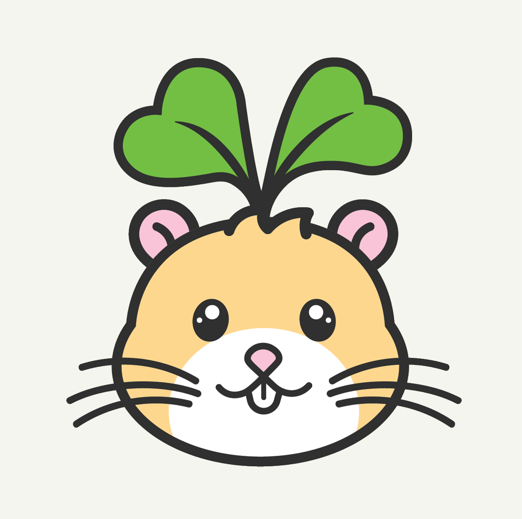
Why A sprout?
Each character is topped with a two-heart sprout leaf, symbolizing the love for a pet’s wild and wholesome sides. This sprout reflects the brand’s dedication to organic ingredients, promoting natural care for pets’ health and well-being. Bringing playfulness to life, these characters embody the joyful bond between pets and their owners.
The two-heart sprout is more than just a design element; it represents the growth, vitality, and care that Wild & Wholesome stands for. By connecting each character to nature in this way, the brand emphasizes its commitment to sustainability and the idea that wholesome ingredients lead to happier, healthier pets.
LOGO MARKS
Growing with the Sprout
The Wild & Wholesome logo combines the brand’s playful personality with its commitment to natural care for pets. Placed above the ‘O’ in ‘Wholesome,’ the two-heart sprout leaf unites the brand’s identity, symbolizing love, growth, and a focus on organic ingredients. This sprout, shared with the animal icons, ties all visuals together, reinforcing Wild & Wholesome’s dedication to sustainable and joyful pet care.
The loose, rounded font adds to this friendly vibe, creating a logo that feels inviting and playful. Altogether, these elements build a cohesive identity that highlights the brand’s values of quality, care, and sustainability in every detail.

Dog PACKAGING
The Wild & Wholesome dog treats packaging is designed to be bright, friendly, and easy to recognize. On the bottom, a QR code and “Our Story” invites pet owners to learn more about the brand’s dedication to pet wellness.
This design appeals to pet owners with its cheerful look while assuring them of the high-quality, organic ingredients inside.

Cat PACKAGING
The Wild & Wholesome cat treats packaging is designed to be bright, friendly, and easy to recognize. On the bottom, a QR code and “Our Story” invites pet owners to learn more about the brand’s dedication to pet wellness.
This design appeals to pet owners with its cheerful look while assuring them of the high-quality, organic ingredients inside.

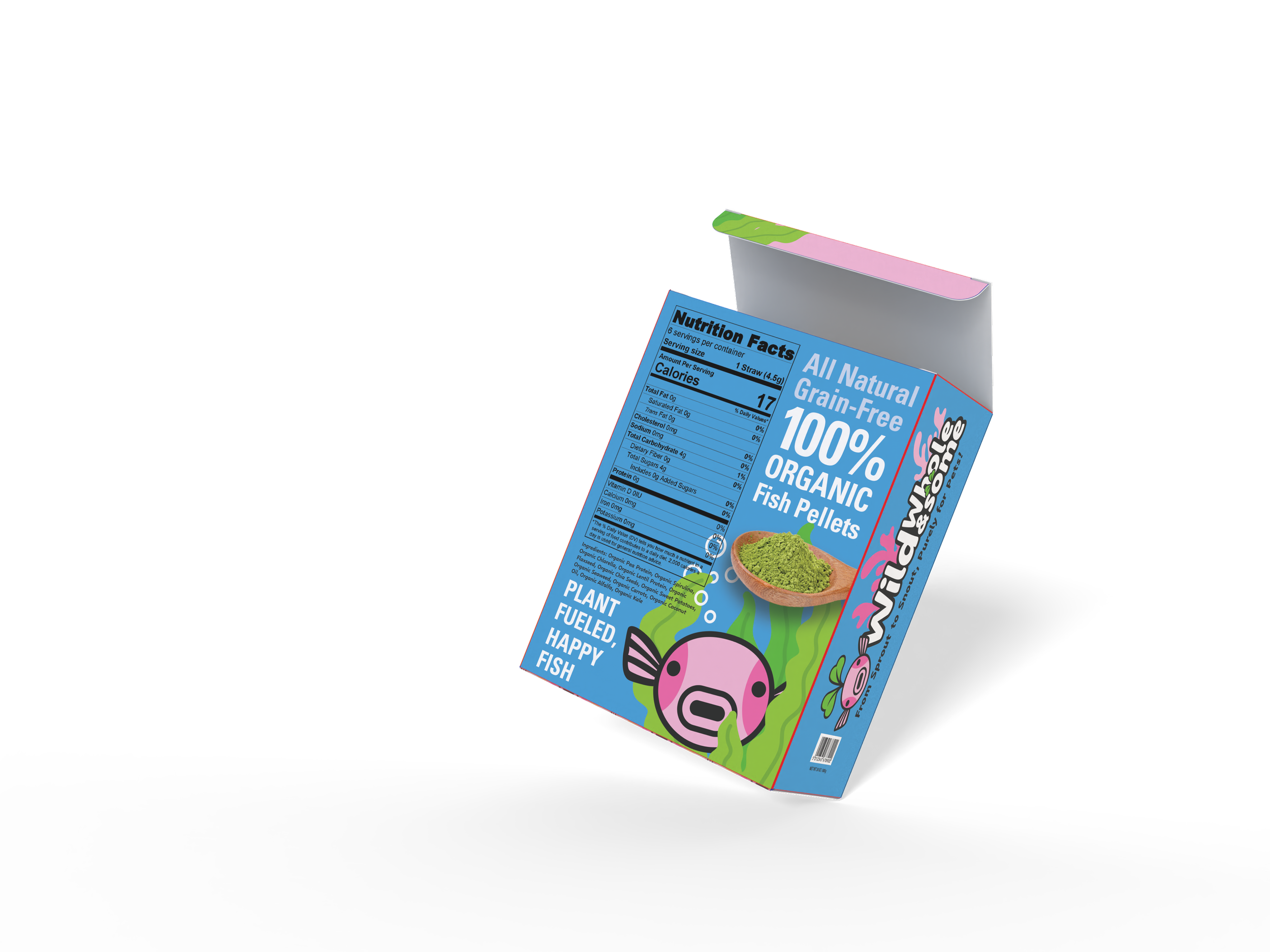
Fish PACKAGING
The Wild & Wholesome fish pellets packaging is designed to be bright, friendly, and easy to recognize. On the bottom, a QR code and “Our Story” invites pet owners to learn more about the brand’s dedication to pet wellness.
This design appeals to pet owners with its cheerful look while assuring them of the high-quality, organic ingredients inside.

Protein-Style Packaging
For the secondary packaging, I opted for a protein-style tub to house Wild & Wholesome’s pet treats. This unconventional choice is rarely seen in the pet product space, making it a clever and attention-grabbing option.
The tub’s unique shape and size help the packaging stand out on shelves, offering both a fresh and practical twist.
I drew inspiration from the Ghost protein line, which effectively leverages bold branding across various flavors and collaborations, such as their Chips Ahoy protein flavor. Similarly, this tub packaging allows Wild & Wholesome to maintain a strong, playful brand identity while introducing a standout design that’s memorable and fun for pet owners.


MOCKED Up VISUALS


Deliverables
Here are the deliverables from the Wild & Wholesome rebranding project. You'll see designs for t-shirts, stickers, and a landing page created for the cat treats checkout experience—all crafted to reflect the new brand identity.

