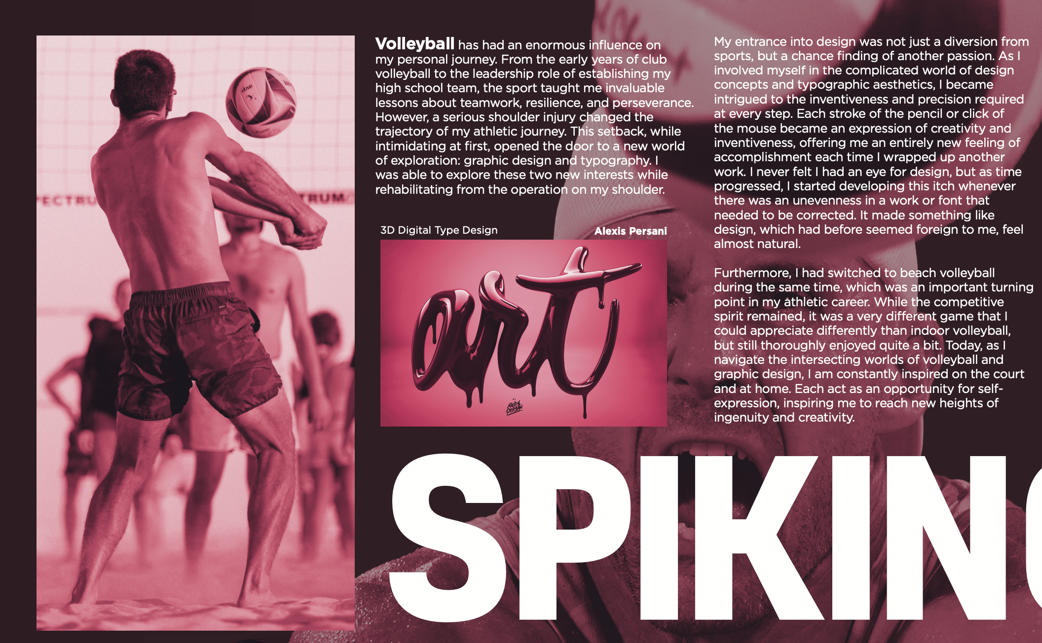
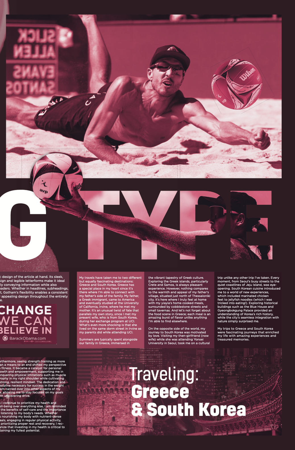
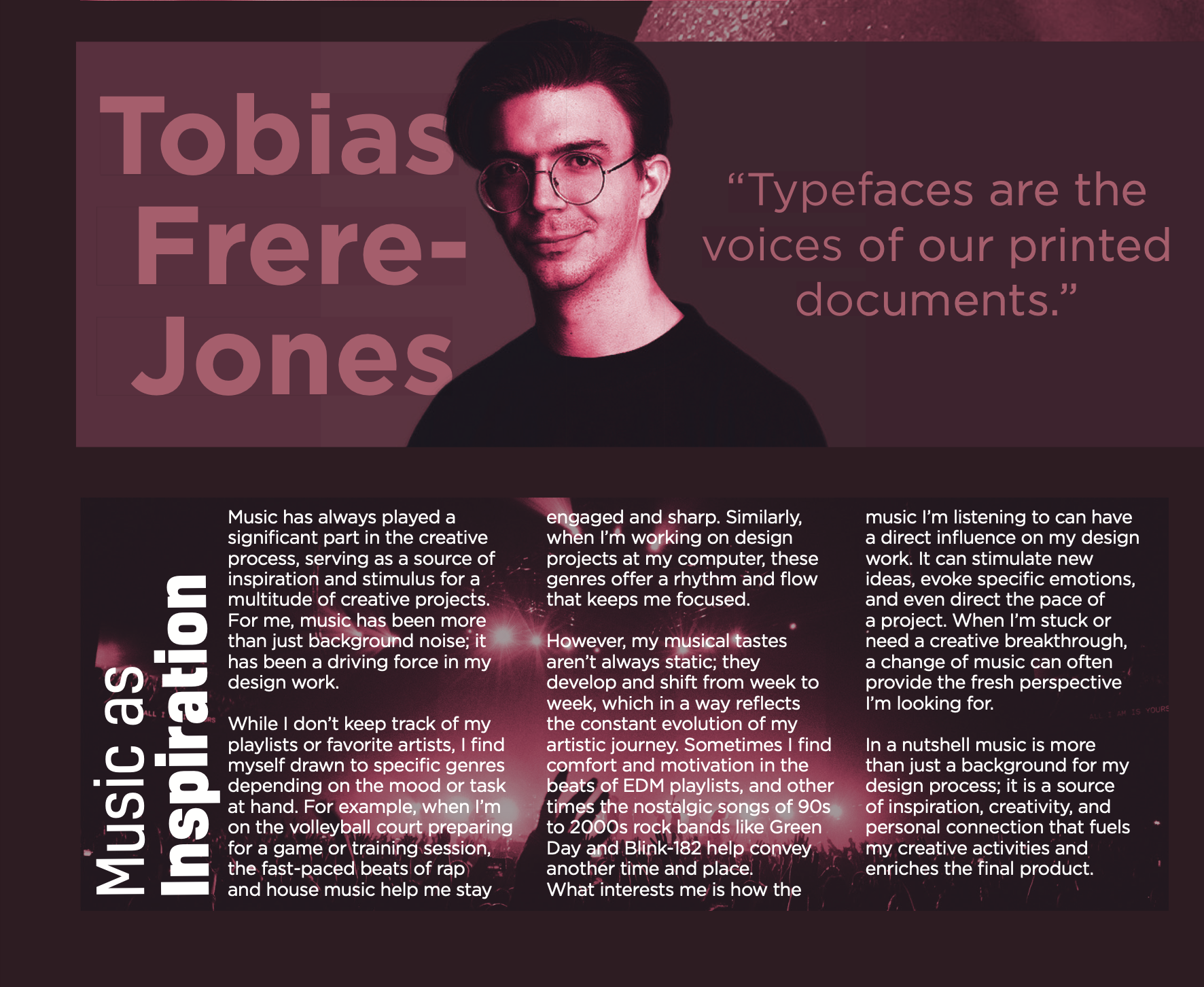
TYPE Identity Newspaper
This newspaper spread is an exploration of typographic grids, personal storytelling, and design experimentation. The front cover functions as a bold, poster-like composition prominently featuring my monogram mark, while the back side follows a structured type grid layout showcasing mini-articles that reflect my personal interests, experiences, and a featured typography artist. The monogram is thoughtfully integrated throughout the design, reinforcing a cohesive visual identity.
Additionally, this project served as a study in duotone color application, pushing the boundaries of contrast, legibility, and aesthetic impact. By blending structured typography, expressive design choices, and my personal branding—including the repeated use of my monogram—the result is a dynamic and thoughtful composition that reflects both my technical skill and creative voice.

Type GRID SKETCHES

Monogram Explorations